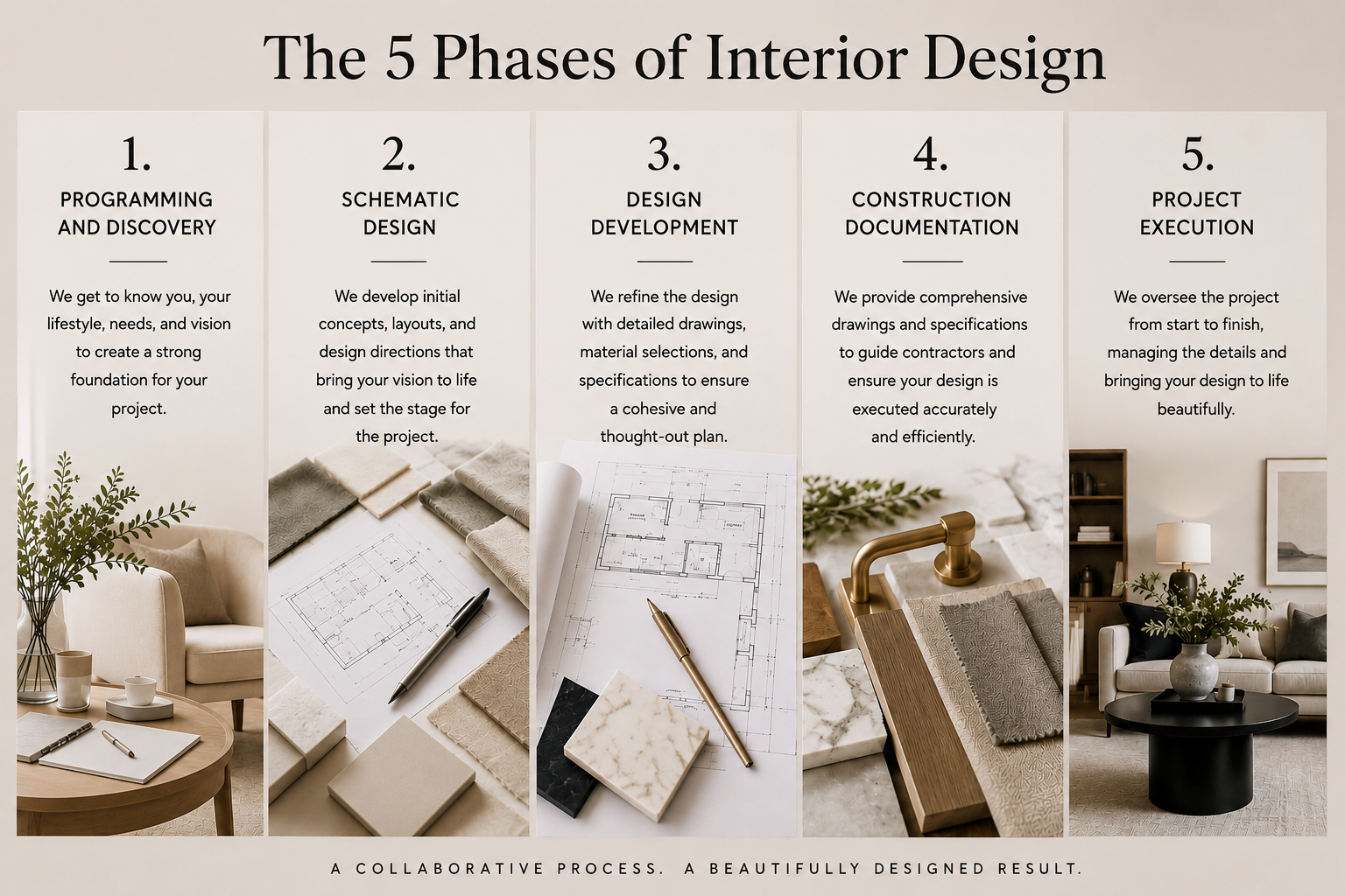
The Five Phases of Interior Design
Talie Jane Interiors
June 29, 2026
Color is one of the most powerful and transformative tools in interior design. It shapes mood, reveals personality, and creates harmony from room to room, whether you’re dreaming of a serene retreat, a lively gathering space, or a beautifully balanced whole-home palette. And while choosing colors can feel overwhelming, understanding how color schemes work makes the process exciting, not intimidating. At Talie Jane Interiors, we believe color should inspire confidence and creativity. So, let’s explore the core color schemes designers rely on every day, plus real-world examples and simple tips to help you bring each one to life in your own home. Analogous Color Palette Colors side-by-side on the color wheel, like blue, blue-green, and green. Analogous palettes are soft, seamless, and wonderfully calming, think lush forest paths or ocean horizons. Because these hues flow effortlessly into one another, they’re perfect for spaces made for rest: bedrooms, cozy reading nooks, spa-like bathrooms, or anywhere you want to unwind. Start with one anchor color, then layer in its neighboring hues to create gentle movement and depth. Designer Tips: Monochromatic Color Palette One color, many tints, tones, and shades. Monochromatic palettes are the epitome of elegance. They’re refined, timeless, and visually soothing, […]

Color is one of the most powerful and transformative tools in interior design. It shapes mood, reveals personality, and creates harmony from room to room, whether you’re dreaming of a serene retreat, a lively gathering space, or a beautifully balanced whole-home palette. And while choosing colors can feel overwhelming, understanding how color schemes work makes the process exciting, not intimidating.
At Talie Jane Interiors, we believe color should inspire confidence and creativity. So, let’s explore the core color schemes designers rely on every day, plus real-world examples and simple tips to help you bring each one to life in your own home.
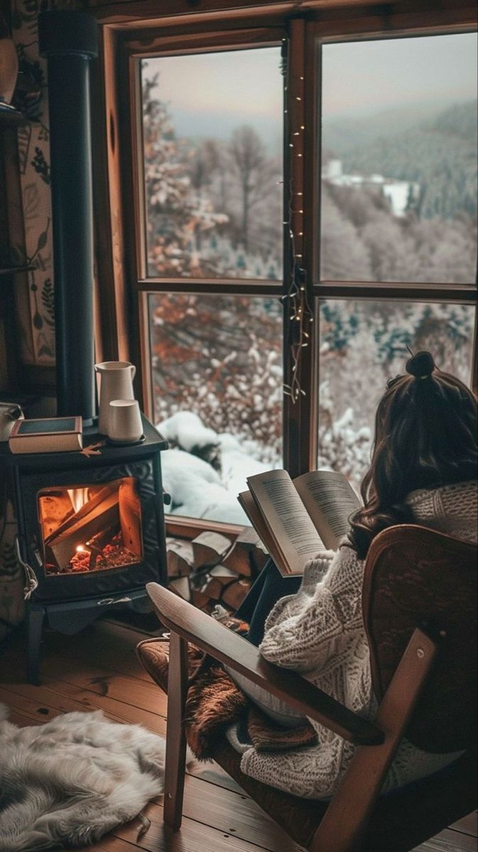
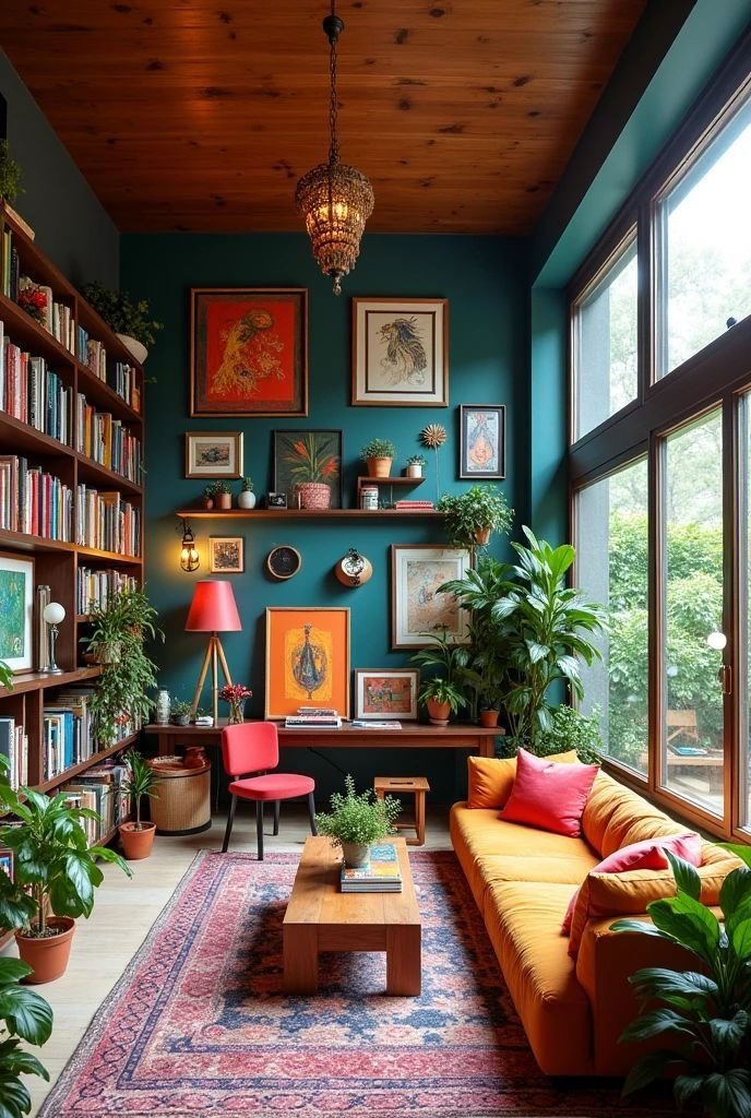
Colors side-by-side on the color wheel, like blue, blue-green, and green.
Analogous palettes are soft, seamless, and wonderfully calming, think lush forest paths or ocean horizons. Because these hues flow effortlessly into one another, they’re perfect for spaces made for rest: bedrooms, cozy reading nooks, spa-like bathrooms, or anywhere you want to unwind.
Start with one anchor color, then layer in its neighboring hues to create gentle movement and depth.
Designer Tips:
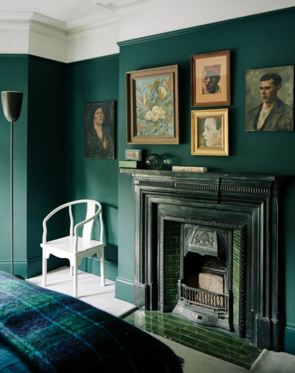
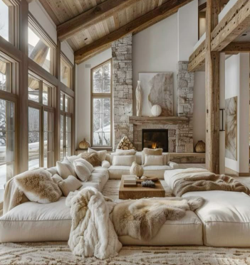
One color, many tints, tones, and shades.
Monochromatic palettes are the epitome of elegance. They’re refined, timeless, and visually soothing, perfect for modern homes, minimalist interiors, primary suites, and living rooms where tranquility rules.
With this approach, texture becomes your best friend. When color stays consistent, materials and finishes do the heavy lifting.
Designer Tips:
Anchor the room with a dominant tone, then sprinkle in lighter and darker iterations for visual balance.
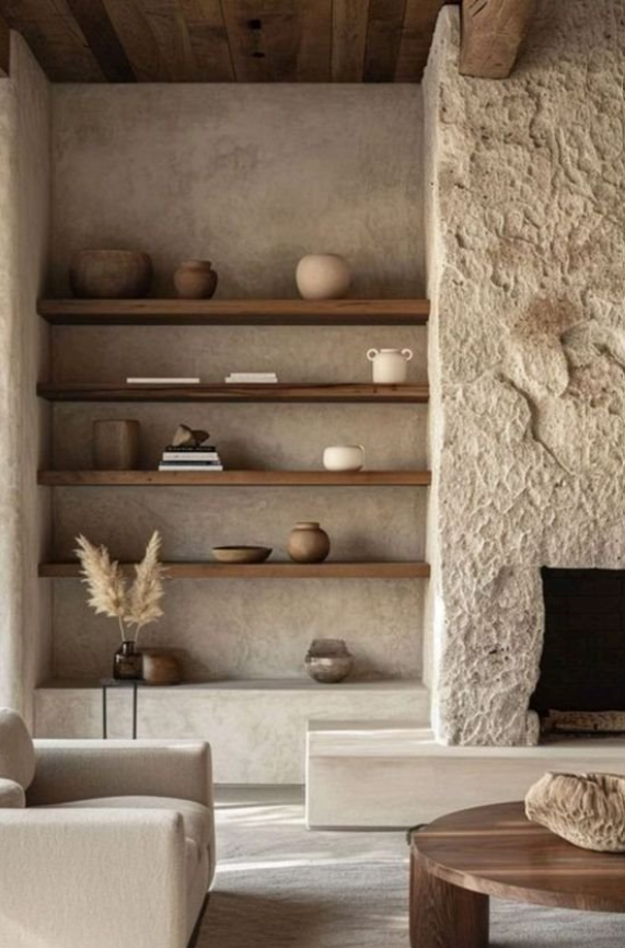
Whites, beiges, browns, grays, and blacks.
Timeless, versatile, and effortlessly stylish, neutral palettes are the foundation of many Talie Jane Interiors projects. They highlight architecture, spotlight textures, and let standout pieces shine.
Designer Tips:
Bring in warmth through greenery, wool throws, woven textures, or leather accents.
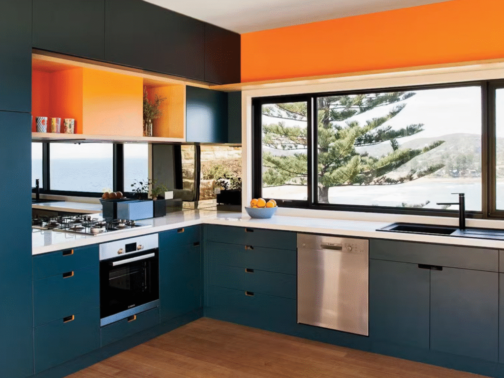
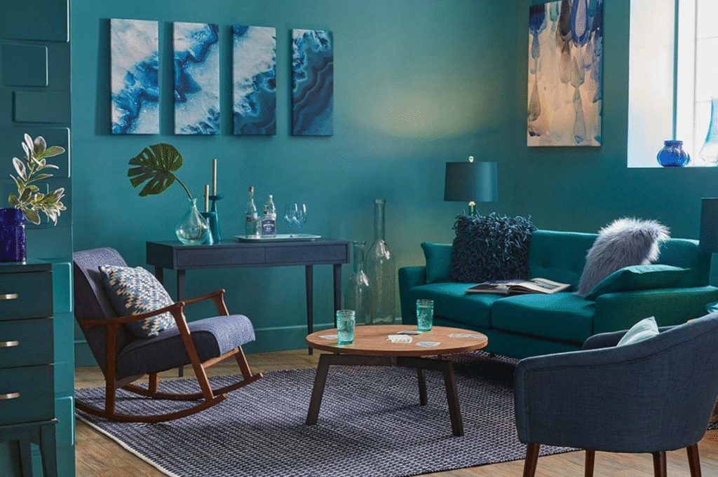
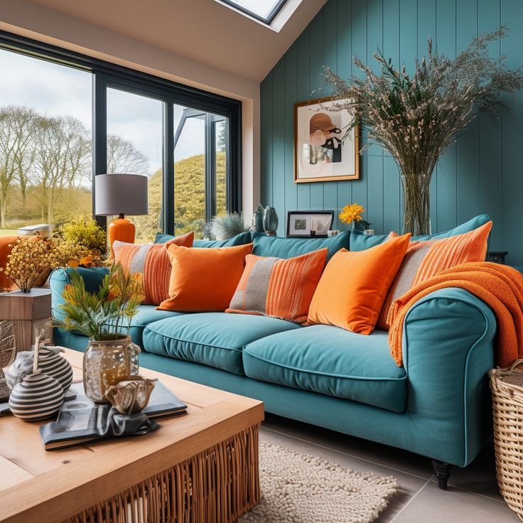
Opposites attract, literally. Think blue & orange.
Complementary palettes deliver bold, eye-catching contrast. These pairings create energetic tension that feels vibrant and lively, ideal for kitchens, creative offices, or game rooms. Because they’re naturally high-impact, balance is key.
Designer Tips:
Opt for muted versions (navy + burnt orange) if you want something softer yet still dynamic.
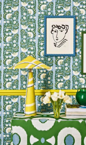
One base color paired with the two hues beside its complement.
This scheme delivers contrast without the intensity of direct complementary colors. It’s lively yet livable, great for family rooms, dining spaces, and areas where you want personality with finesse.
Designer Tips:
For a polished feel, stick to softened, desaturated shades.
Three colors evenly spaced around the color wheel, like rust, gold, and teal.
Triadic palettes are creative, colorful, and wonderfully balanced when executed thoughtfully. They bring joyful energy to kids’ rooms, studios, playful guest rooms, or eclectic interiors.
Designer Tips:
Choosing a color scheme is about more than selecting pretty hues, it’s about creating a home that feels intentional, welcoming, and unmistakably you. Whether you’re drawn to the peaceful flow of analogous colors, the effortless refinement of monochromatic design, or the spirited contrast of complementary palettes, the right color story will elevate your home in subtle and stunning ways.
At Talie Jane Interiors, we love helping homeowners discover the colors that tell their story. When you’re ready to bring your vision to life, we’re here with the creativity, expertise, and thoughtful design approach to make it happen.
Call us at 855-TALIE JANE.
Article by the Talie Jane Interiors Team
https://www.homesandgardens.com/interior-design/what-is-an-analogous-color-scheme
https://www.thespruce.com/understanding-analogous-colors-1973820
AI
Pinterest
Dwell magazine, 6 modern paint colors that make a statement
DWELL MAGAZINE, 10 bold kitchens dripping with vivacious color
DWELL MAGAZINE, 10 kitchens dripping with bold vivacious color
What is a Monochromatic Color Scheme and How Do You Follow It? | HGTVA Beginner’s Guide to Monochromatic Color Schemes in Design