Designer Greg Natale debuts his first book, The Tailored Interior.
The Tailored Interior offers an inside look at the designer’s enigmatic design process. Sections range from the expected (a primer on paint types) to the more nuanced (how to style your cushions).
We caught up with the designer to get the trusty checklist he applies to all of his projects.
Find your starting point: “The starting point can be hard for a lot of people, but what you have to remember is it can be anything! In my first apartment, it was a pair of 1970s cocktail tables that I bought at an auction. They were tiered, with black glass, and I went for a very glam Halston, Studio 54 look. A lot of times it’s art. But it could also be the era of the house or the location, or even a client’s personal style.”
Get your walls, floors, and ceilings right: “Get on Pinterest and make a mood board, or literally cut and paste your samples and pin them on the wall. It’s so important that you get these foundations right. And you have to do a test wall. I know it sounds like a total cliché, but I painted 50 shades of gray on my wall when I was trying to decide on the right one. I spent days with each shade. I kept searching for the right one—it can be too purple, too green, or too warm.”
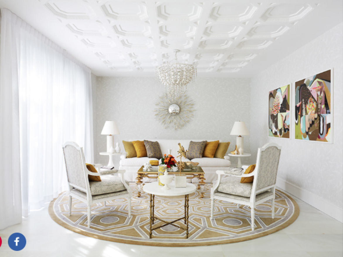
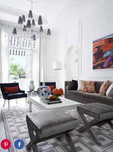 Think about proportion: “Whether I’m working in a small or a large space, we always have the same amount of furniture. There’s a sofa, a cocktail table, a side table, and a rug. But if you have a larger space, you scale everything up. In my Brisbane project, for example, we used rugs and marble parquetry to designate different areas in a big space. Then we added ten-foot sofas and two cocktail tables instead of one.”
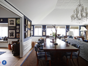 Build your layers: “Decorating is really just about layering. But for this step, I like to think about the curtains. I decorated an Oklahoma home that was heavy with a lot of timber so we used thick wool for blinds. With a house on the water, you might want to use sheer curtains.”
Check for contrast: “A well-balanced room is what I want. You have to use your eye and your intuition—you can usually just tell if the balance is off. You want an interplay between sheer and heavy, gloss or matte. It’s like an outfit. If you have too much of one thing on, you might break it up with a belt.”
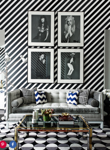 Ensure balance: “I always say that two colors and two neutrals is a good way to begin. It’s not too much. When you break down my work, we use a singular formula in different ways throughout the house.”
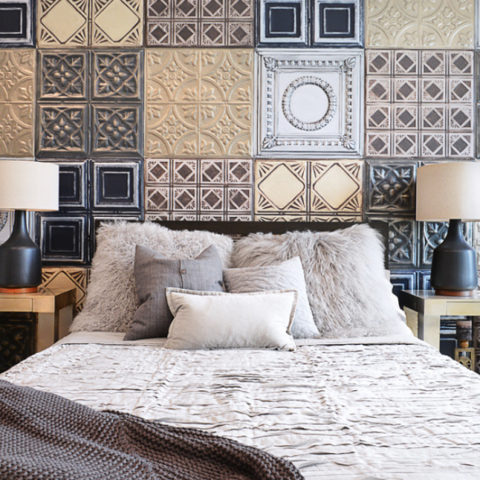
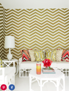 Play with color and pattern: “Follow the steps above, and if you’re scared of color, try blue or green. These are colors in nature that everyone loves. Navy is having a special moment right now. Also, don’t be afraid of wallpaper and pattern—pattern can make a room look a lot bigger. Take the Fitzroy apartment, for example. It’s only 500 square feet but it packs a lot of punch.”
Incorporate objects: “When you’re choosing objects, always make sure to look at your starting point. If your concept was black and white, maybe you inject some brass or silver. I always find that a client is either a silver person or a brass person; they’re never in between.”
Edit for cohesion: “I’m always editing and moving things around. We always have these amazing technical plans, but at that install stage rooms always need a bit of fine-tuning.”
Come back to your starting point: “I’ll always go back to the starting point and make sure that I stay true to my vision. I can tell straight away if I’ve veered off. As a designer you see things all the time that might make you want to change the direction of a project, but I’m all about staying disciplined so that things have a cohesion and flow. If a client has a good idea, of course, I will run with it. But if they don’t, I will tell them no.”
Article published on Architectural Digest
Sorry, the comment form is closed at this time.