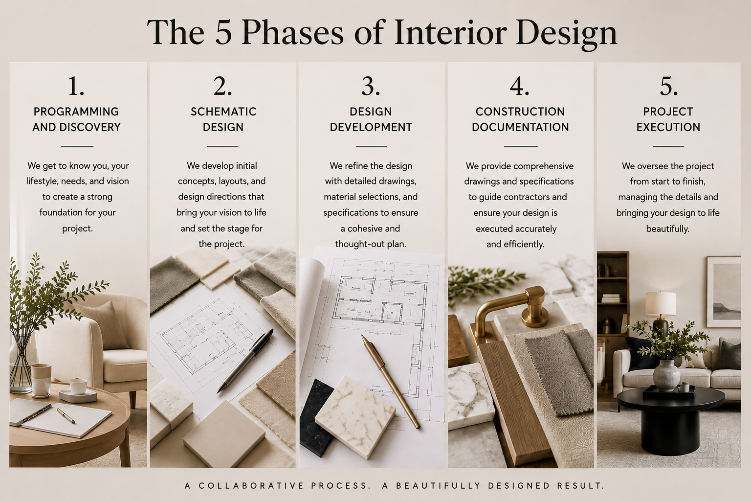
Talie Jane Interiors®

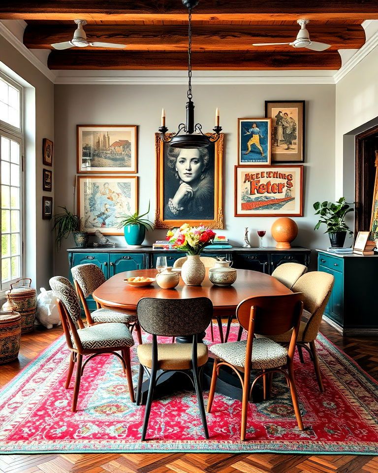
Interior design is full of "rules" like don't mix metals, keep ceilings white, match your furniture, and avoid dark colors in small spaces. But some of the most beautiful homes come from knowing when to break those rules.

At Talie Jane Interiors, we believe design should reflect the people who live in a space. While design guidelines are helpful, they're not one-size-fits-all. Sometimes stepping outside the traditional rules creates a home that feels more personal, inviting, and memorable.

In this month's blog, we're sharing a few design rules we intentionally break and why those choices often lead to spaces with more character, balance, and style.

The Kitchen Work Triangle

The Kitchen Work Triangle is one of the most well-known design rules, developed in the 1940s to connect the sink, stove, and refrigerator for maximum efficiency. While it works well in smaller kitchens designed for a single cook, today's kitchens often serve multiple people and many purposes beyond meal preparation.

That's why we often favor a zone-based approach, organizing the kitchen around specific tasks rather than appliance placement. For example, a coffee station may keep mugs and supplies together, a prep zone can house cutting boards and utensils near the main workspace, and a snack area allows family members or guests to help themselves without disrupting the cook.

If the traditional work triangle naturally works within the layout, that's a great bonus. But rather than designing around a decades-old rule, we focus on creating kitchens that support how our clients actually live, cook, and gather.

Art Doesn't Always Need to Follow the Rules

We've all heard the traditional guidelines: hang art at eye level, center it on the wall, and keep it about two-thirds the width of the furniture below. These rules come from galleries and museums, where artwork is displayed for standing viewers in neutral spaces. And while they're a great starting point, homes aren't galleries.

In residential design, we care more about how a room feels than whether every measurement follows a formula. Sometimes artwork looks best slightly lower to connect with a seating area, off-center to create visual interest, or layered into a gallery wall that feels collected over time. Following the rules too strictly can make a space feel staged rather than lived in. We prefer to hang art where the room asks for it, not just where the rulebook says it should go. After all, if the artwork itself isn't always symmetrical, why should its placement be?

Drapery Isn’t Just for Windows

There are plenty of traditional rules when it comes to hanging drapery: mount the rod several inches above the window, extend it beyond the frame to maximize natural light, and let the drapery float just above the floor. These guidelines create a polished look and are often a great place to start.

But sometimes we like to break the rules. Drapery can do so much more than frame a window. We love creating full curtain walls to add softness and drama, using drapery behind a bed in place of a headboard, or even hanging drapery within doorways and transitions to create a sense of intimacy and texture. In our opinion, the more layers a room has, the more inviting and luxurious it feels. When used creatively, drapery becomes less about the window and more about shaping the entire experience of a space.

Not Everything Has to Match

For years, design advice has encouraged perfectly coordinated spaces - matching furniture sets, identical finishes, and color palettes that never stray from the plan. While this approach can create a polished look, it can also make a home feel more like a showroom than a place where real life happens.

That's why we love mixing things up. A modern sofa paired with a vintage coffee table, contemporary artwork alongside an antique mirror, or dining chairs that don't perfectly match can add character and tell a story. These unexpected combinations create depth, personality, and a sense of authenticity that perfectly coordinated rooms often lack.

Of course, balance is still important. We typically tie a space together with a common color, material, or overall mood, but we leave room for contrast and individuality. After all, a home should reflect the people who live there, not a furniture catalog. Sometimes the most interesting spaces are the ones that break the rules just enough to feel truly personal.

Perfect Symmetry Isn't Always the Goal

Symmetry has long been a design staple, with matching nightstands, identical lamps, and perfectly balanced layouts creating a sense of order. While this approach can be beautiful, it can also make a room feel a bit formal or predictable.

That's why we often embrace asymmetry. Instead of matching everything exactly, we focus on creating visual balance. A floor lamp can be balanced by artwork, or a statement chair can offset a collection of smaller accessories. These unexpected pairings make a space feel more relaxed, collected, and personal.

Not every room, or homeowner, is perfectly symmetrical. By letting go of the need for everything to match, we create spaces that feel more natural, dynamic, and truly lived in.

Dark Colors Can Make Small Spaces Shine

One of the most common design rules is that small rooms should always be painted light colors to make them feel larger. While light colors can certainly create an airy feel, they're not the only option.

In fact, we often love using dark colors in smaller spaces. Rich paint colors, moody wallpaper, or darker cabinetry can add depth, drama, and personality that lighter shades simply can't achieve. Rather than making a room feel cramped, dark tones can blur boundaries and create a cozy, enveloping atmosphere.

Powder rooms, offices, reading nooks, and even small bedrooms are some of our favorite places to embrace darker hues. Sometimes the goal isn't to make a room feel bigger, it's to make it feel unforgettable.

At the end of the day, design rules exist for a reason; they provide guidance, structure, and a helpful starting point. But the most memorable homes aren't created by following every rule perfectly. They're created by understanding the rules and knowing when it's worth breaking them.

Whether it's abandoning the traditional work triangle, mixing styles and finishes, embracing asymmetry, hanging art in unexpected ways, layering drapery beyond the window, or choosing dark colors in a small room, the goal is always the same: creating spaces that feel authentic to the people who live in them.

Great design isn't about perfection. It's about personality, function, and telling your story. Sometimes the best design decisions happen when we stop asking, "What am I supposed to do?" and start asking, "What feels right for this space?"

If you're ready to create a home that feels more personal, functional, and uniquely you, we'd love to help. Whether you're reimagining a single room or designing an entire home, our team is here to challenge the ordinary and bring your vision to life.

Give us a call at 1-800-TALIEJANE and let's break a few design rules together, beautifully, of course.

Article by the Talie Jane Interiors Team

Sources:

Chat GBT​
Pinterest​

the work triangle for kitchen - Search

layering curtains - Search

*Our amazing brains!