In the world of interior design, a vignette is a small, pleasing picture formed by grouping several objects — think of it as a pocket-size table arrangement that tells a story about you and your home. A vignette is a harmonious tableau made from a variety of items, rather than a large collection of similar articles (for example, clocks or toys), which would require a different display strategy.
Vignettes can easily be reinvented to suit your whims — a change of season, a new find, a gift and a special occasion are all good reasons to refashion your mini displays. There’s a knack to making these small scenes look effortlessly composed and eye catching. So take a look at how to build delightful vignette worlds with this easy lesson.
“A” Is for “Anchor”
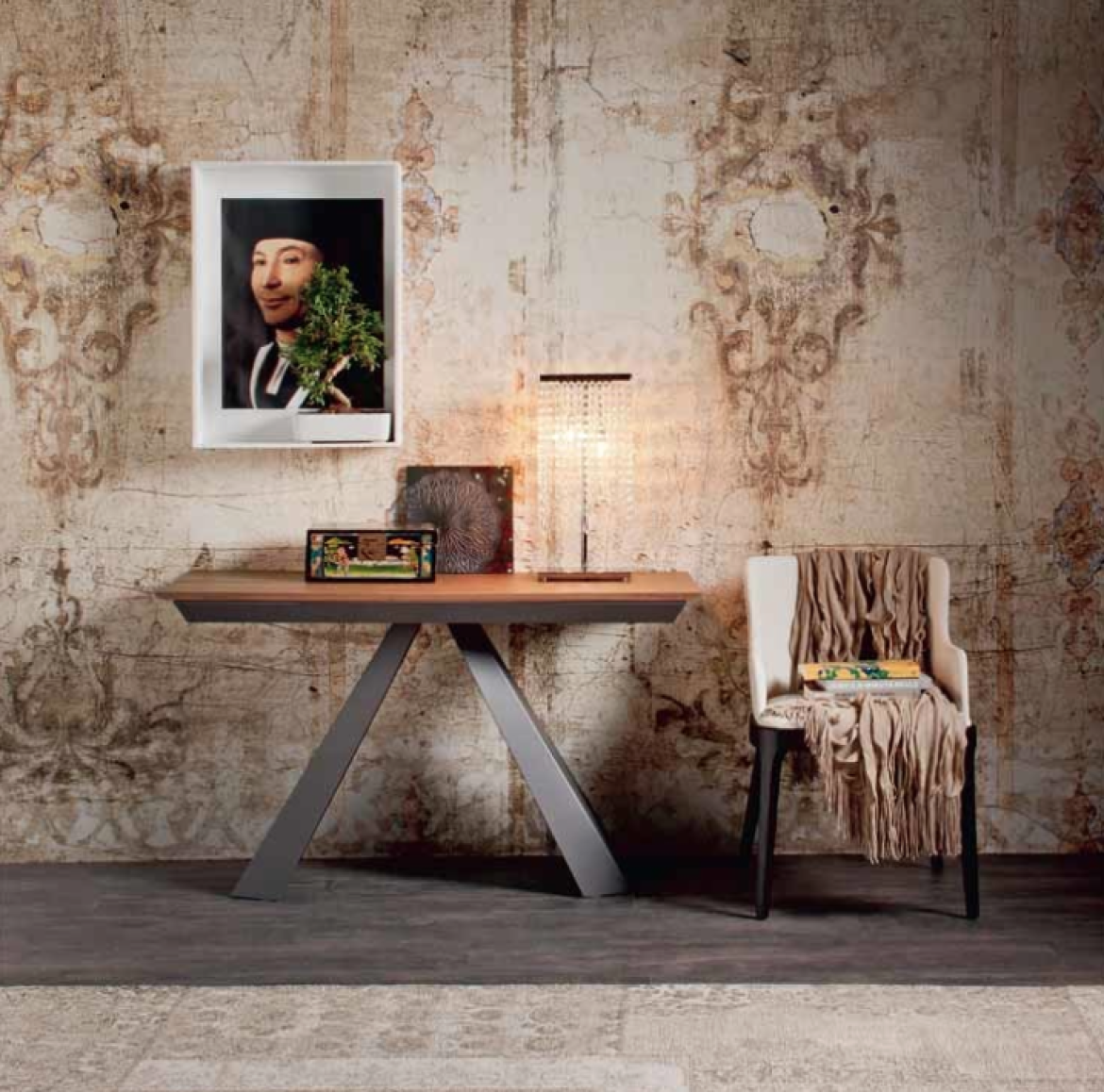
Choose an item as the center of interest, the “hero” of your vignette. Pick something you love to see every day and that expresses your personality and that of your home. It will be the first point on which the viewer’s eye rests. A very small hero would be swamped by other objects in the group, so choose a statement piece with visual weight and height.
An “A” Formation
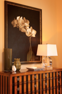
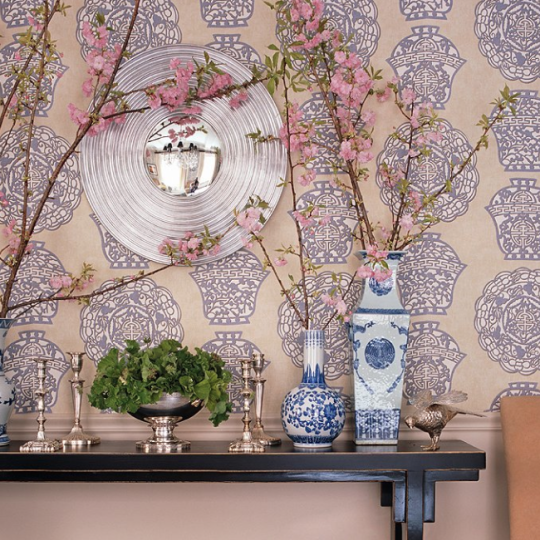
Assemble your pieces and then superimpose an imaginary “A” or triangle over them. Use this visual structure to prevent a long skyline effect, which would scatter focus, and to carry interest around the frame. Positioning the shortest objects toward the outer edges will help form your “A” shape. Despite breaking the “A” rule, linear arrangements can work beautifully if there is a strong relationship between the objects and some contrast.
Asymmetry
Sorry, all you neatness nuts, you may have to loosen up. Pairs placed symmetrically give the impression of an altar and can look very stilted and formal. We want the opposite: an unstudied gathering (only you know you have been to ABC vignette class!) that moves the eye around the articles. Deconstruct a too-tight structure by moving the items of a pair closer together or taking one of them away.
“B” Is for “Background”
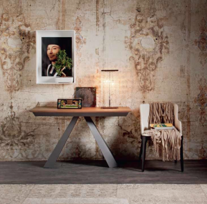
Your display’s backdrop is a vital part of it. Complicated wallpaper can cause visual chaos behind intricately patterned objects. And a vignette featuring, say, orange, may pick an argument with a red or green wall. Backgrounds act in a positive way when they unify the vignette.
Balance
Several objects of similar height or color placed at one end of a table or bench create an unbalanced look. A lopsided placement needs variety within it and visual connection to the rest of the surface. Balance it with a tall central object, such as a painting or sketch, and a secondary grouping opposite.
“C” Is for “Commonality”
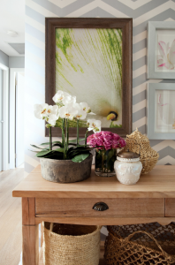
Give the members of your vignette a reason to be together. Relate them by color, texture, theme, shape and/or pattern. When one or more of these elements is repeated, the eye travels enjoyably around the vignette.
Contrast
Play with contrasts. Think of fresh flowers highlighting the patina of an antique bronze bell, or a delicate woven basket beside a heavy glass bowl.
Coziness
Pieces spaced evenly over the whole surface lose their connection to one another and may end up looking as if they are set out for a garage sale. Snuggle them up to one another and let some of them touch.
Cost
Vignettes are a wonderful way to give every room character, and they need not cost the earth. Collect flowers from your garden, a vintage shoe, pretty glass bottles or an attractive feather, or reframe old photographs or wallpaper offcuts. Hunt through your house and see what treasures you can find.
Sorry, the comment form is closed at this time.