Talie Jane Interiors®

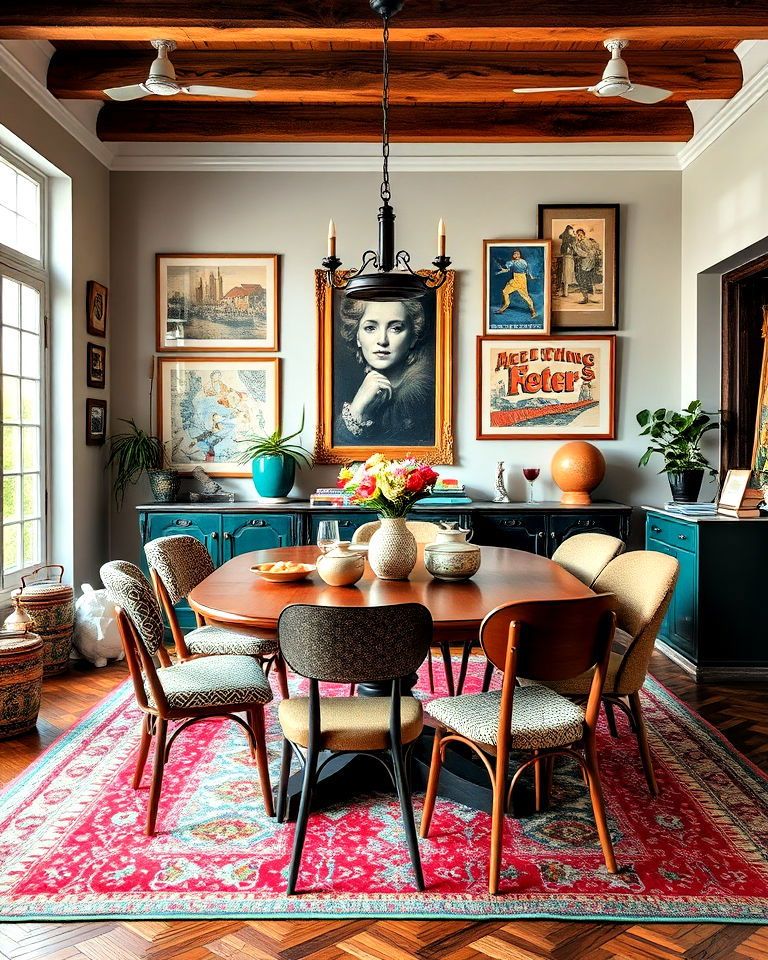
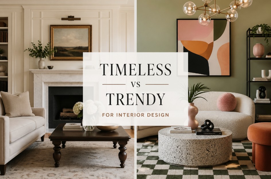
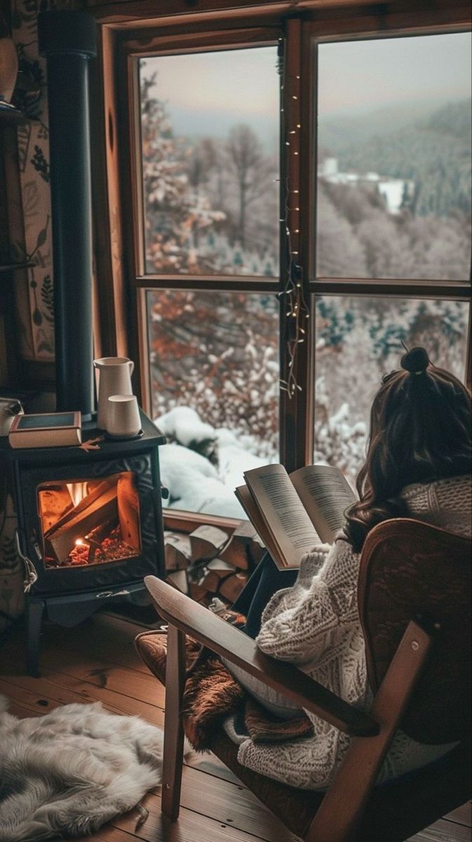
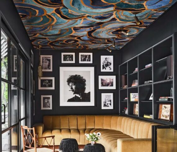
If 2026 had a design motto, it would be this: your home, but louder—in the best way. The coming year is all about interiors that feel personal, inviting, and quietly brilliant. Think cozy warmth layered with bold choices, timeless craftsmanship paired with cutting-edge tech, and spaces that feel lived-in rather than staged. Minimalism had its moment, but now? Personality is back—and it’s thriving. Welcome to the Era of Hyper-Personalization One of the biggest shifts shaping interiors in 2026 is hyper-personalization. Homeowners are moving away from copy-and-paste interiors and leaning into spaces that reflect who they truly are. Expect expressive color palettes to take center stage—rich plums, moody teals, sun-warmed terracottas—balanced by tactile, touch-me textures like bouclé, velvet, and handwoven textiles. Statement art, custom millwork, and heirloom-quality furniture are becoming non-negotiables. These aren’t rooms designed to impress Instagram—they’re designed to tell stories. Your stories. Maximalism Returns (With a Little Maturity) Yes, maximalism is officially back—but it’s grown up a bit. Instead of visual chaos, 2026 embraces intentional layering. Fearless pattern mixing, playful accessories, and richly layered color palettes create homes that feel joyful, collected, and expressive without being overwhelming. The result? Spaces that feel curated over time rather than rushed into […]

Read More

Color is one of the most powerful and transformative tools in interior design. It shapes mood, reveals personality, and creates harmony from room to room, whether you’re dreaming of a serene retreat, a lively gathering space, or a beautifully balanced whole-home palette. And while choosing colors can feel overwhelming, understanding how color schemes work makes the process exciting, not intimidating. At Talie Jane Interiors, we believe color should inspire confidence and creativity. So, let’s explore the core color schemes designers rely on every day, plus real-world examples and simple tips to help you bring each one to life in your own home. Analogous Color Palette Colors side-by-side on the color wheel, like blue, blue-green, and green. Analogous palettes are soft, seamless, and wonderfully calming, think lush forest paths or ocean horizons. Because these hues flow effortlessly into one another, they’re perfect for spaces made for rest: bedrooms, cozy reading nooks, spa-like bathrooms, or anywhere you want to unwind. Start with one anchor color, then layer in its neighboring hues to create gentle movement and depth. Designer Tips: Monochromatic Color Palette One color, many tints, tones, and shades. Monochromatic palettes are the epitome of elegance. They’re refined, timeless, and visually soothing, […]

Read More

It’s that time of year again when ghosts, goblins, and ghouls make their annual appearance, but some design mistakes haunt homes all year long. These 7 Deadly Design Sins might not rattle chains in the night, but they can certainly send shivers down a designer’s spine. Don’t worry, though, this isn’t a horror story without hope. With a few tricks (and some design treats), you can banish these bad habits for good! #1 Dead Space: The Design Graveyard Every home has it, that awkward corner or empty wall that just seems to exist without purpose. Maybe it’s the space under the stairs or that lonely spot beside the sofa where nothing seems to fit. This “dead space” can make your home feel incomplete and lifeless. To revive it, think of every inch of your home as an opportunity. Add a cozy reading chair, a tall plant, or a console table with styled décor to bring energy and intention to forgotten areas. Even a well-placed piece of art can resurrect a neglected corner. A well-designed home doesn’t leave any space to rest in peace. #2 Poorly Placed Lighting: The Phantom of the Flat Room There’s nothing scarier than bad lighting, it […]

Read More

The kitchen is my favorite room. The cabinet detailing, marble backsplash and countertops and color-coordinated island are fabulous. Love, love, love. This same color combination and “modern” touch is mimicked in the master bathroom. The staircase is also amazing. Maintaining the 1915 look and feel, the homeowners kept the spindles and stained glass window.

Read More

Whether they’re lighting a half bath or a grand entryway, globe fixtures have a way of giving a room understated polish. In fact, I’ve had to hold myself back from using them in too many rooms in my house, lest my home begin to look like a planetary constellation. Still, I find myself drawn to images of rooms lit by gorgeous glowing spheres as I continually seek out new ways to use them in my home that won’t make my family feel like we’re living in the International Space Station.

Read More

Get Template