Color is a universal language and a powerful communication tool. Of all the elements that make up a visual design, color is perhaps the most vital influential. It plays a vital role in fine arts such as painting and photography, advertising and branding, fashion, beauty, industrial design and of course interior design.
But what is it about color that goes beyond the simple hues we see in the rainbow?
Color psychology is the study between color and human behavior. In other words, color psychology perceived color as a trigger of perceptions, feeling and emotions. It’s a fascinating field that explores how different hues can influence mood, decision-making and even physiological reactions, often in ways that operate beneath our conscious awareness.
And why is color so important in the psychology of interior design?
The answer lies in its ability to define a room’s purpose and influence its occupants’ behavior. This interplay between colors and our minds significantly impacts how we experience different environments. The strategic use of color in interior spaces can guide how we feel and act, making color psychology a vital tool for designers aiming to create spaces that are not only aesthetically pleasing but also emotionally and psychologically supportive.
Often when we think of color in relation to interior design, we consider how the hues look. But you also need to consider how the colors used in a room will make you feel. When you enter a space, are you overcome with a sense of calm that washes through you? Do you feel energized and ready to take on your day? Or do you notice tension creeping through your body, and all you want to do is escape your surroundings? Hues are carefully chosen to invoke a certain emotional response in people and set a particular mood.
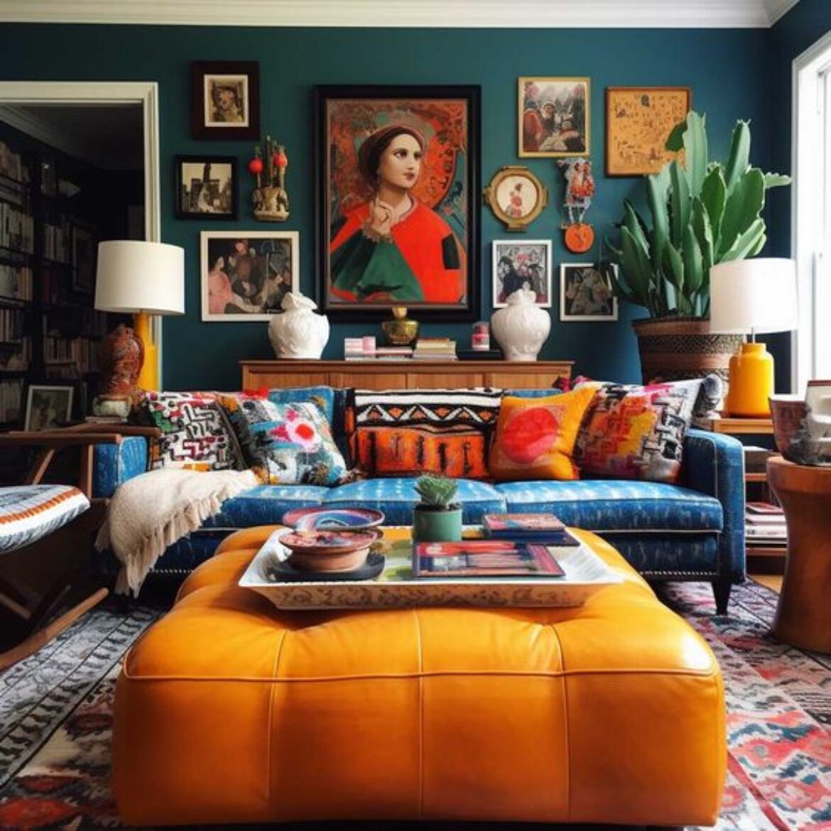
For instance, warm colors like orange or red evoke feelings of energy, excitement, and enthusiasm. In contrast, cooler colors, such as green and blue, are more likely to create a sense of calm and relaxation. But why colors affect the way people feel isn’t straight forward. Several elements can influence the way a person feels when exposed to a certain color. Other factors that can influence color perception are cultural background, personal experiences, and context, so it’s essential to consider these factors when interpreting the psychological effects of color.
Here’s a breakdown of some common associations with different colors:
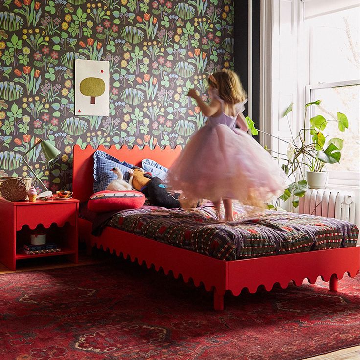
Red: Often associated with energy, passion, and excitement. It can also evoke feelings of danger or urgency. Red is commonly used to grab attention, which is why it’s often used in advertising and warning signs.
Blue: Known for its calming and soothing effects (when we immerse ourselves in the ocean, our bodies tend to feel tranquil and restored), blue is often associated with trust, stability, and professionalism. It’s frequently used in corporate settings and healthcare facilities.
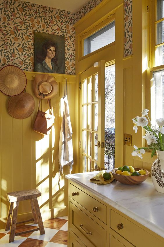
Yellow: As the most attention-grabbing color visible to our eyes, yellow is great to use when you want to stand out. In color psychology, feelings of cheerfulness, warmth, hope and fun are commonly associated with yellow too. Those emotions are probably influenced by our connection to the sun, as we tend to represent it visually with yellow. Yellow is quite a playful tone, and it can brighten up any areas of austerity. A darker hue like mustard is grounding and striking, while a light yellow is sweet and uplifting. Regardless of what shade you decide, yellow will never fail to bring a dash of optimism into your space.
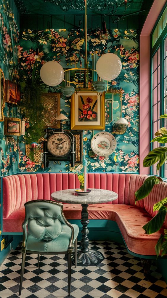
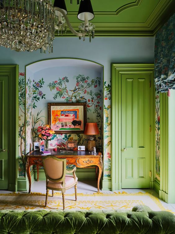
Green: Green reminds us of the natural world, and we feel comforted by its refreshing qualities. Green color psychology is primarily based on this understanding and reflects safety, renewal, growth and peace. From a scientific standpoint, low wavelength colors such as green have been found to improve focus, which is excellent for practical areas like the kitchen. Green can also be interpreted as positive and energizing, as green in a set of traffic lights permits us to move forward and go. Use green to create a calming, natural ambience.
Purple: Historically associated with royalty and luxury, purple can also evoke feelings of creativity, mystery, and spirituality. It’s often used in branding to convey a sense of elegance and sophistication.
Pink: Known for its sweet and uplifting sensibilities, encompassing emotions of calm, love, compassion, and kindness. Pink is traditionally associated with femininity, but as we’re progressed, it is commonly used in interior design regardless of gender. And in the 18th and 19th centuries, pink was even considered to be very masculine!
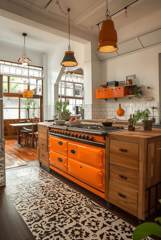
Orange: Like red, orange is a high-energy, dynamic color that can evoke feelings of enthusiasm, warmth, and excitement. It mixes the driven energy of red and the joyful feeling of yellow to produce an adventurous, extroverted personality. It’s often used to create a sense of urgency or to promote action. If you like lively colors or environments, orange could be the choice for your kitchen. It’s terrific for encouraging vitality and very fitting for homes that enjoy hosting. As orange is profound and rich, it could be a conceptual approach to cultivating warmth if you live in a cold climate or honor your region’s hot weather. A great way to implement orange into the kitchen is through backsplash tiles. If that’s too intense, try incorporating materials like terracotta or warm timber cabinetry.
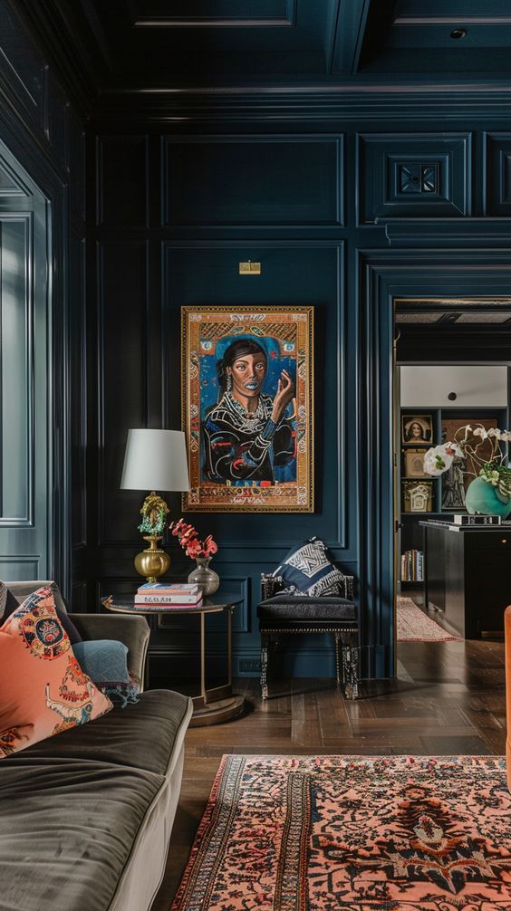
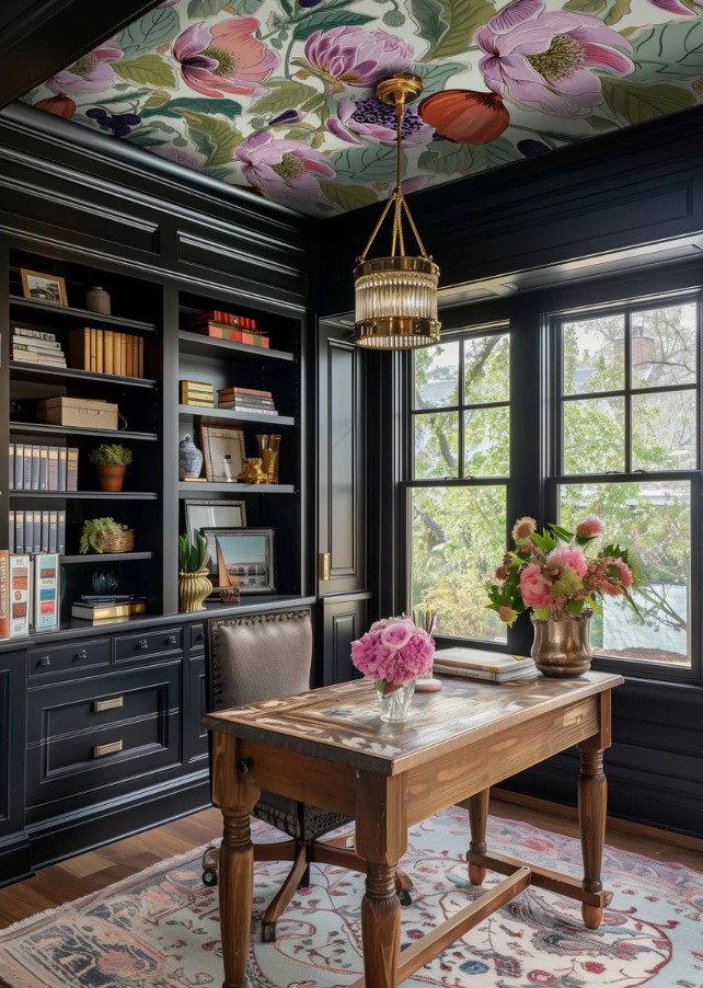
Black: Mysterious, sophisticated and alluring, black is a famous tone for fashion and homes. Its high versatility is renowned worldwide, but could our collective adoration for it have an underlying psychological reason? In color psychology, we associate black with strength and power. In Fengshui, the color black is associated with water and represents calmness, creativity, depth and perseverance. It can also convey a sense of mystery or formality. In design, black is often used to create contrast and make other colors stand out.
White: White in color psychology can represent innocence, purity, creativity and cleanliness. It embodies the concepts of new beginnings and refreshment, as white is the original blank canvas. White is a popular tone in homes, as white reflects all wavelengths of light, allowing a space to feel bright and illuminated.
Gray: Sitting between black and white is grey, an impartial and soft tone. As far as color psychology goes, its neutrality means that it doesn’t have too much internal effect. With that said, certain grey tones can feel somber, while others can feel sophisticated. Its diplomacy creates a stable environment, allowing you to experiment with other colors.
Incorporating color theory into interior design is more than just an aesthetic choice; it’s a powerful tool that can transform spaces and influence emotions. Understanding the psychological impact of colors allows designers to create environments that look beautiful and feel right. Whether you’re aiming for a tranquil retreat, a vibrant social space, or a cozy sanctuary, the thoughtful application of color can help you achieve your desired atmosphere. So, next time you embark on a design project, remember that the colors you choose can make all the difference.
Talie Jane Interiors is here to help. Contact us at 855-TALIE JANE (855-825-4352) for help harnessing the principles of color theory and immersing yourself in design spaces that enhance well-being, boost mood and create the perfect backdrop for life’s many moments.
Article by the Talie Jane Interiors team.
Sources:
https://verywellmind.com/color-psychology-2795824
https://toptal.com/designers/ux/color-psychology
Color Psychology In Interior Design (hommes.studio)
Understanding the Psychology of Color in Spaces | Stoneside


Sorry, the comment form is closed at this time.