Using multiple colors can define zones, highlight features or just add that special something.
Choosing a paint color is one of the most enjoyable parts of the decorating process, but it can also be one of the hardest. Which shade to choose from among the dozens of test patches on the wall? If you’re torn, why not consider using more than one? There are lots of reasons multicolored walls work. They can make the room more interesting, differentiate zones, change the proportions of a space or simply look beautiful. Here are 10 multicolored ideas to inspire you.
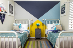 Add to a theme. The designers of this kids’ bedroom have added to the nautical flavorwith a flag-style wall. The effect is fairly easy to achieve — using just four colors and easy-to-mask-off triangles — but the effect is striking and fun.
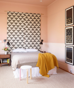 Color outside the lines. You’d normally expect a wall of two colors to be separated by a dado or picture rail. In this room, not adhering to those boundaries has created an interesting effect. By painting the ceiling the same color as the upper part of the wall — and painting over and below the picture rail — the designer has given the already high room even greater depth. Artwork and wall hangings that cross the divide break up the lines nicely.
Go for an ombre effect. One of the most beautiful things about paint is that you can mix it to the exact shade you desire. This also means you can create a graduated, ombre effect on your walls for something truly special. A darker ceiling creates a cozy effect, but you could reverse the colors and go light at the top for an airier feel. If this paint effect seems too tricky, you can always cheat with ombre wallpaper.
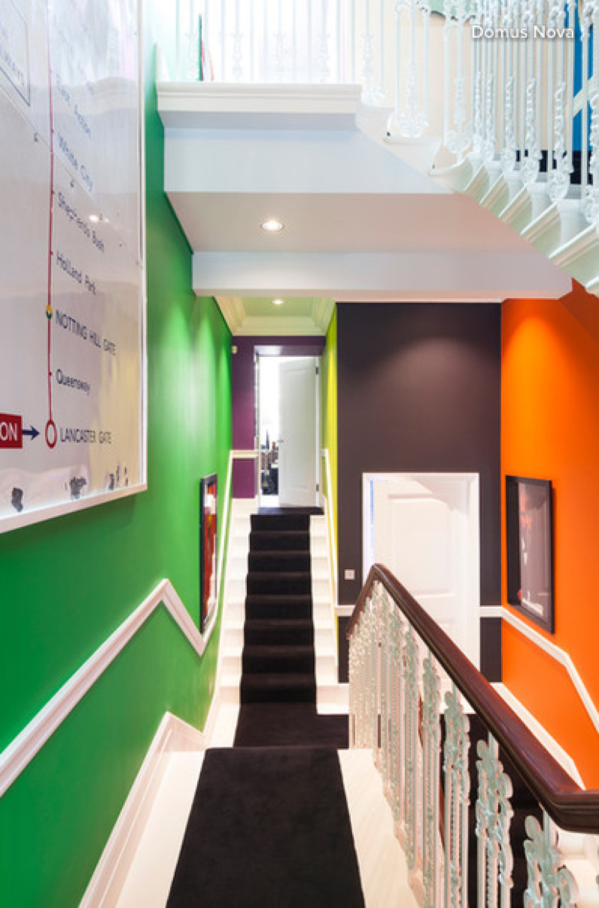
Bring personality to a hallway. We tend to walk through transitional spaces such as hallways and stairwells without paying much attention to them. Turn these areas into features by using multiple colors on the walls. You can go for bright shades, or opt for a variety of neutrals for something a little less bold.
Zone a space. Painting a recessed area a different color than the rest of the room is a great way to indicate that the spot has a distinct purpose.
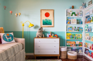 Set a scene. In this cheerful-looking room, the darker and lighter turquoise shades suggest the sea and the sky. The setting sun in the painting brings the look together perfectly.
Draw attention to sculptural shapes. If you have a curved wall or unusually shaped structure, turn it into a feature by painting it one or more different colors. This makes a room more interesting and is also useful for zoning areas.
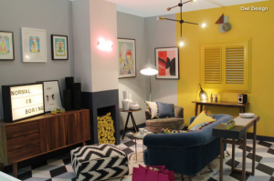 Mix up proportions. Here, the designers have used color to change the visual proportions of the room and cleverly zone the desk area under the shutters. They’ve also used two colors on the chimney surround to give the illusion of a fireplace — perfect for a minimalist look.
Make a tall room more intimate. Accentuate cornicing and draw down a high ceiling slightly with a two-tone wall. Paint the ceiling and walls down to the picture rail in white and the walls below in a darker hue.
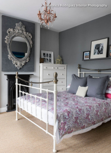 Work subtle shades of the same color. This light gray chimney surround works with different shades of the same color in the rest of the room to add subtle interest and highlight the architecture.
Article published on Houzz.com

1 Comments:
Sorry, the comment form is closed at this time.